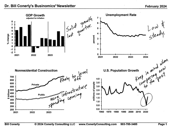
How did I get the idea to print out economic charts and hand-write notes about what they mean? It’s a fun story.
A long time ago I was a corporate economist who briefed the Executive Committee every month. I provided a handout that had words describing the economy, with charts embedded in the text. One month, they changed their meeting schedule at the last minute, giving me just one day to prepare the handout—and my secretary was on vacation. In those days, combining text and graphics on a page required special skills, which I lacked. I was very ticked off that the schedule change prevented me from providing our CEO and top executives with my handout.
I printed out some graphs and hand wrote comments on each graph, then photo-copied the pages. It looked far less professional than my previous handouts. I was still angry at the schedule change.
My plan walking into the meeting was at the first gripe about the handout, I would tell them that this is what you get when you jerk the schedule around. I was unhappy and loaded for bear.
I passed around the handout—which looks a lot like the current newsletter—and heard praise! “Bill, great job. Good idea. Really like it.”
It turned out that thousands of people like the format. I appreciate the praise, but it’s really the last minute schedule change that inspired me.


